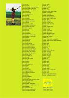
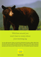
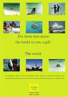
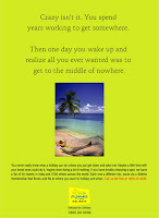
Mamallapuram is a weekend getaway for people in Chennai, and a beach holiday destination year-round for everybody else. Temple Bay is located right on the beach.Apart from the suites and rooms, sea-facing cottages are the accommodation types. When GRT took over, we launched it with this press and outdoor campaign. Positioned as an upscale leisure hotel, the brand celebrates togetherness and quietude. Agency : Maitri / Art Director : Jagan
|| Advertising Agency in Chennai || Steppenwolf provides creative solutions in advertising, websites and brochureware ||
topalternatewidget
You're at the blog of Steppenwolf Creative Solutions.Feel at home.
Sundaram Home Finance

We volunteered to create a visual bank for Sundaram Home Finance (SHF, the people who finance your home) and the result was a shoot assignment that involved multiple models, multiple locations and spread over 3 months owing to complications in logistics.
Thankfully, the client had the wisdom and the patience to have an elastic deadline, and got rewarded with a fantastic visual archive for a bargain. Most of the pictures we shot are still used in the SHF marcom ( a few that happened to be handy are featured here).
Special thanks to Sujit, who is not only a wizard behind the lens, but also a rarely-ruffled, suave co-ordinater with above-ordinary patience and tact. And how can I forget the incredibly talented Santy, who took time off from his demanding Kollywood schedule to make sure the shoot came out the way we wanted it to.
This one is a wall mural
in the head honcho's cabin
at the company's
Corporate HQ.
Andhra Paper
While the use of icons continues to be a recurring theme in advertising, I like these ads for their relevance and simplicity. The client had launched anti-fading copier paper. We decided to use the campaign for a corporate rub-off, while introducing the product.The campaign got a Silver at Chennai Ad Club.
Done for Andhra Pradesh paper Mills ( APPM ) at Maitri Advertising, Chennai. Rajan did the art.
In retrospect, maybe we should have fought harder for the Che and the Chaplin - the Leo Burnett guys used them ( very stylishly , I might add, albeit a few years later) for Luxor highlighters.
Club Mahindra
When research firm McKinsey turned in their market and brand research docket to Club Mahindra, it turned out to be a mandate that was -quite improbably-delivered by a fledgling creative consultancy called Steppenwolf Creative Solutions.
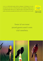
It started with a seemingly innocuous meeting. We were retained by Club Mahindra for a few ad-hoc creative executions. What followed was a dramatic turnaround period for the brand – a time of rapid and unprecedented growth during which time our Marcom Solutions played an effective, at times critical and often critically acclaimed role in the marketing mix.
Steppenwolf Creative Solutions’ body of work for Club Mahindra spans a full spectrum of media. We’ve done Press Ads, BTL, Events, DM, Digital and Outdoor.
Some of these are ads, some are jpegs of other artworks, others are concept cards/roughs. 5 of the ads featured here (Paradise Lost, Free, Elope, The Happiest Families, Morning Jog) were done by Mel. Rajesh, now with Lintas Bombay, did the Club 2 Bear Hug poster.The rest were done by me.


Club 2 : Aimed at the sizeable newlyweds/DINKS segments of the market, we named the variant Club 2 for research/review purposes. In an eventual avatar, it became the woefully inadequate, wishy-washy sub-brand called Zest (!). As my friend Sam would often say with the zeal of the dyed-in-the-wool adman, there's 'no point in a brand having half-an-attitude.'Such are the adman's battles.

Rajesh did this lovely poster. He heard me without batting an eyelid, gave me the line off-the-cuff, narrated the visual and sauntered away. If you look through the ads above you'll spot the bear and the tent as separate pictures.


Hinduja Hospital
Advertising for healthcare is challenging. Effective and wholesome healthcare branding is nuanced, yet marked by clarity of thought and simplicity in expression : advertising traits not commonly found in today's style of anything-goes / in-your-face school of marcom. Shown here are some outdoor-format-skins done for Hinduja Hospital, Bombay. These also include concept-level-roughs.
Topical ads in the outdoor format.
Live To Give Hope: This one was the first of the hoardings I did for the brand. It was hectic getting the artwork out in record time.Happily, we found a digital camera in a hurry, and a colleague lent a helping hand- or should I say two.In retrospect, a neat job and well worth the pressure.
World No Tobacco Day Hoarding. Subhash did the art. The towering and affable Sundu shot the picture, did the compositing and gave me a CD to mail in under two hours. Whoever said 'nothing would ever get done if it weren't for the last minute' must have worked in an ad agency.Special thanks to Venkat for coordinating this one with Sundu on a particularly packed day.
Ads I did on the brand for the pitch. (The ones I like). The logo isn't the one in use- we had recommended a logo makeover as part of our pitch, this one was indicative / illustrative.
UPDATE The old "building" logo has formally been dropped, you can see the current logotype on the hospital's website.
Cataract : Even in an era of visual ads, sometimes there just is no substitute for typography.
Working towards a future without Cancer.
Mumbai's Landmark Multispecialty Hospital.
Subscribe to:
Posts
(
Atom
)


